RDU · Durham
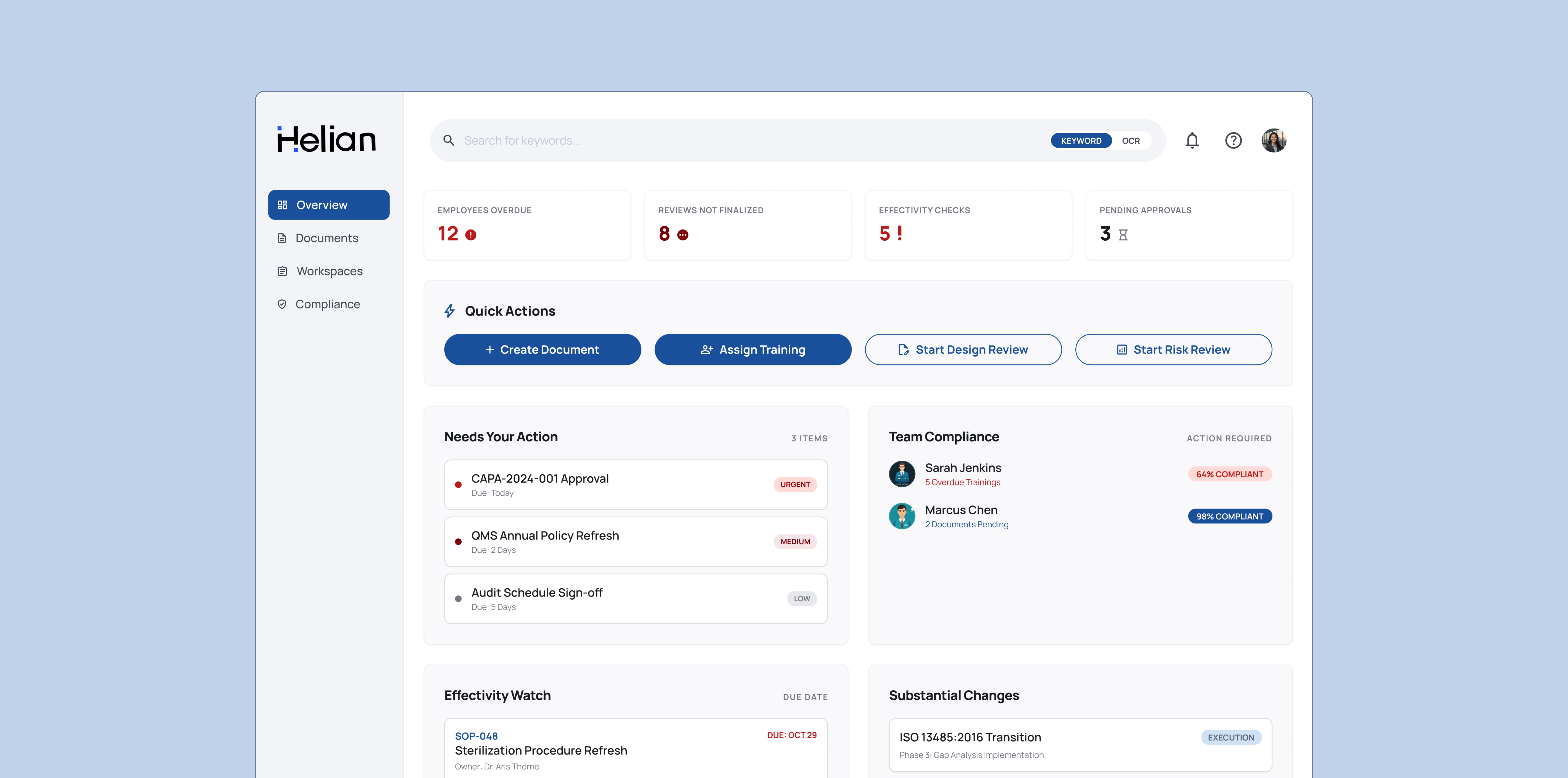
Helian QMS Dashboard
Redesigned a medical-device QMS so daily compliance triage takes one glance instead of 30 minutes.
- Role
- Designer
- Timeline
- NOV 2025 – MAR 2026
- Technical Dialect
- Figma
- <60sProjected daily triage
- 1-clickProjected actions (from 8+)
- 2.5 hrsProjected savings per admin/wk
Problem
Helian is an AI-powered Quality Management System for early-stage medical device companies. The product had everything it needed, but answering "is anything on fire today" required jumping between 8+ sidebar destinations and about 30 minutes of manual aggregation. Critical signals like overdue training, effectivity checks, and in-flight substantial changes were buried in metadata, which left leaders blind to audit risk until it was already a finding.
Solution
I redesigned the home screen as an action-first dashboard. It surfaces compliance state in real time (overdue trainings, unfinalized reviews, effectivity checks, in-flight regulatory changes) and turns the most-used sidebar journeys into one-click actions. Compliance triage now takes a glance, not half an hour.
§ Shipped
What I built
The Process
Design architecture
Optional deep dive — how the problem became the shipped product.
Market & user research
Benchmarked Helian against Greenlight Guru and Dot Compliance, then browsed Reddit threads from users of current QMS services to identify pain points. The friction was the same across every competitor: feature bloat. The interfaces store everything but surface nothing. That set the direction for the redesign, shifting Helian from a search-first product to an action-first one, with role-gated dashboards for QMS admins and standard users.
Surfacing what was already there
Designed the new dashboard on top of existing Helian data with no backend changes. The layout splits into four jobs: a compliance snapshot (overdue training, unfinalized reviews), a regulatory watch (effectivity checks, substantial changes), an action queue sorted by due date, and a team board that flags non-compliant employees before audit risk becomes a finding.
Designing the dashboard
Mapped the layout to the question users actually open the app to answer: "is anything on fire today?" Quick Actions collapse the two-click sidebar journeys into one-click entry points, and a Days-in-Status field on each release item surfaces stalled blockers. The result removes the tabbed triage admins used to navigate and replaces it with a single screen where the next action is one click away.